Photo Cleaner Done Differently: Swipe Right to Keep, Swipe Left to Delete
· Winki Team · Photo Swipe Cleaner · 5 min read
Every photo cleaner on the market treats your gallery like garbage to burn. We built one that treats every picture like a memory. The story of a 10,000-photo stress test, a Tinder-inspired swipe, and the redo/undo safety net that made decluttering feel calm.

This developer note is about Photo Swipe Cleaner. Visit its product page for features and download options. Winki develops this app.
TL;DR — Most photo cleaners treat your camera roll like trash waiting to be burned: find duplicates, delete in bulk, done. We think your gallery is a collection of memories that deserve care. So we built a photo organizer where you decide one picture at a time — swipe right to keep, swipe left to delete, with a safety bin and undo. Here is how we made “efficiency” and “care” coexist.
Why another photo cleaner? Because the category got it wrong
When I surveyed the market before building this, almost every photo cleaner app fell into one of these buckets:
- Duplicate finders that compare images and bulk-delete the copies.
- Type/source sorters that wipe screenshots, downloads, and blurry bursts by category.
- Similarity sweepers that batch-delete lookalikes.
- Date organizers that group and purge by day.
- Storage optimizers where photo cleanup is just one buried module inside a phone cleaner.
Look at that list again. In every single one, your photos are treated as junk to be burned by some automated rule. Nobody stops to ask: what if the duplicate you’re deleting is the one where your kid’s smile is actually in focus?
I wanted the opposite: a photo organizer that goes through pictures one at a time — carefully — while still being fast enough to finish a 10,000-photo gallery in one sitting. (You can read the broader product vision in our Photo Swipe Cleaner user story.)

The technical challenge: deciding the interaction is the product
The core design question wasn’t “how to delete.” It was: what interaction makes one-at-a-time review feel fast and safe? Every attempt below taught us something.
Attempt A: batch selection grids
We tried showing the gallery as a selectable grid — one column, two, up to four per row. We settled on three per row: clear enough to actually see each photo and avoid mis-taps, efficient enough to keep pace. But a grid is still a selection tool. It doesn’t help you decide.
Attempt B: the 10,000-photo stress test
I built a test library of 10,000 images and hammered the app with different loading strategies, compression, and caching architectures. The results were brutal: cache bloat crashed the app, freed space lagged, and deleted photos kept showing ghost placeholders in the collection view — especially on low-end phones. That test drove the performance work that eventually made the app stable at scale. (See how we keep the engine lean in our Photo Swipe Cleaner team notes.)
Attempt C: asking the OS for help
We looked hard at the platform photo APIs for higher-level support. What we found: very little. The system gives you raw assets and permissions; the “decide what matters” part is entirely on the app. So the UX had to carry the weight.
Attempt D: the delete-confirm-delete trap
The classic flow — tap delete, confirm, delete — felt awful. So did long-press, confirm, delete. Both make you feel like a bureaucrat processing paperwork, not a person sorting memories.
The breakthrough: a Tinder-inspired swipe
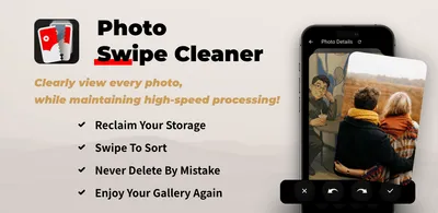
The insight came from an unexpected place: swipe mechanics. Swipe right to keep. Swipe left to delete. No confirm dialogs, no multi-step flows — but with two critical additions:
- Undo and redo during review, so you can revisit a selection before confirming deletion. This is not a guarantee of recovery after permanent deletion.
- A safety bin instead of instant deletion, so nothing is truly gone until you empty it.
That combination gave us exactly the balance the market was missing: speed like a bulk cleaner, care like a human curator. One picture, one decision, zero anxiety. If you want the practical how-to, our gallery decluttering guide walks through it step by step.
What we learned: a good intention needs someone who needs it
The honest lesson from shipping this app: a beautiful idea alone isn’t enough. A good intention needs someone who actually needs it — or, as I like to say, it ends up like this app’s revenue before launch: great concept, zero buyers.
The corollary is the fun part: when you find the right problem, the “careful but fast” interaction is the moat. Swipe-based photo cleanup with a safety net is not just nicer — it changes what people are willing to delete. That’s why we’re keeping the core interaction sacred.
What’s next for Photo Swipe Cleaner
- Even smoother interactions: continued work on the swipe feel and card animation library.
- Faster loading: more performance work so 10,000-photo libraries stay fluid on low-end devices.
Clean your gallery like a curator, not a garbage truck — start swiping on the Photo Swipe Cleaner page.
Frequently asked questions
How is this photo cleaner different from duplicate finders? Duplicate finders bulk-delete by similarity rules. Photo Swipe Cleaner shows you one picture at a time and lets you decide — swipe right to keep, swipe left to delete. No algorithm decides what’s precious.
Is it safe? What if I swipe wrong? Review selections before confirming deletion and keep a separate backup of important pictures. Undo during review is not the same as recovering a permanently deleted file. Your photo service may sync deletions to other devices, and its Recently Deleted or trash retention rules still apply. See the Photo Swipe Cleaner page for the current scope.
Can it handle a huge gallery? Yes. We stress-tested with a 10,000-photo library across loading and caching architectures, specifically to keep low-end phones from crashing or showing ghost placeholders.
Is it really free? The core swipe experience is free and ad-free. Advanced features may come later as optional extras, but one-at-a-time, safety-first decluttering stays central.